homeaboutcontactdisclosure
Showing posts with label silver. Show all posts

Tuesday, June 18, 2013

Avon Cosmic Collection Swatches and Review (Part Two)


Hi everyone!

I want to continue on with the second half of the Avon Cosmic Collection.

If you didn't warm up with the hot shades from the other half, just click the images below to see the rest of the colors along with information on pricing and availability.


Let's move on and cool things down with the icier shades from the collection, shall we?


From left to right:

Moonbeam
Celestial
Galaxy
Aurora
Eclipse


The Colors


 Moonbeam is a silver scattered holo.


Silver holos never disappoint, and under the sun this one is the exception to the "bolder the shade, bolder the holo" pattern this collection possesses.

You can almost see a faint, faint, super faint linear prism at the angle shown in the first photo.


All that holo goodness disappears indoors, but the shimmery silver that's left might just be one of my new go to silvers. 
The formula is just too good to let sit on the shelf.


Celestial is either an icy mint shimmer or a light, teal green with holographic shimmer.


When you look at it outdoors, it's more of the latter. 
The color is much bolder and the scattered holo really shines.


Indoors the color seems to lighten up, taking on a more pastel, minty hue with any icy shimmer.


Galaxy is a bold cerulean blue, with what's supposed to be holographic sparkle.


I was surprised at the hidden the holo is in this particular shade. 
Indoors or out, it just isn't really there unless your hands are positioned in the right way in the right light.


It's such a pretty color either way, does it even really matter?


Aurora is a scattered holo that shifts from violet to purple.


This is the only one that the camera disagreed with just a tad.
The holo is a tad stronger than what is pictured. 
Unfortunately, after rephotographing this shade TWICE the camera came up with the same results.

(Anyone else having Barney flashbacks when looking at this shade?)


This shade is another shape-shifter once you get inside.

While in the sun it's more of a violet, indoors it takes a step to the cooler side of the color wheel and becomes more purple. It also loses the holo, following suit with the others.


...and finally we have Eclipse, a teal going on black with obvious holographic sparkle.


I don't have to justify the holo here, do I?
This shade sparkles better then the twinkly Twilight vampires ever will.

(I apologize for offending at least 75% of you all with that one.)


I know what you're thinking though: "Are you sure that isn't just black?" I'm sure.
It'll look black on the nail while inside, sure. Before you even get to that point you'll notice the teal tinge to the color the second you open the bottle.

Personally I love it so much more this way.
It's so gorgeous and mysterious.


Overall


I applaud Avon for going out on a limb and trying a finish that's a bit ambitious for  a brand that doesn't technically specialize in nail polish.

The holographic is nothing compared to just about any other brand's version, but in fairness this collection was advertised as having a "holographic pearl" finish. To me, this implies that it's intentionally more subtle. If that's the case, then they succeeded.

Holographic or not, these shades are stunning -- every one of them.
They are all eye catching and catch the light both indoors and out.

As far as being cosmic? Well...the formula is certainly out of this world.


What are you favorites from all of these holo hues?
Will you be adding these to your list of shimmery lemmings?

Let me know in the comments below and make sure to give these shades some love on Facebook, Instagram, Tumblr and Pinterest.

Big changes are happening soon here at The Manicured Amateur.
If you're not already, now there's time to be following on Twitter and Bloglovin' for all of the updates.

Thanks for reading!

-Melody


**Products in the post were paid for by me with my own money.
I am not an Avon representative but am proud to encourage readers to order through Julie Pruitt, a long time family friend.

Saturday, June 8, 2013

Sinful Colors Sail La Vie/Ahoy There Collection Review + Nautical Nail Art!


Hi everyone!

I gave everyone quite the build up to this collection with a preview of this nautical nail art design.


Only one collection was used to create the whole look.
Yup, it's the new Sinful Colors Sail La Vie/Ahoy There Collection!

The Collection

Sinful Colors has thrown us overboard once again, giving two different names to the same set.
If you visit Walgreens you'll see this as the "Sail La Vie" collection.
If you visit Rite-Aid, you'll see an entirely different display with the title "Ahoy There!"
I have no explanation as to why the company does this, but the collection is the same both in shades and in price.

Each shade is sold individually for just under $2.


The collection consists of three older core shades and five brand new shades.

Snow Me White
Out of This World
Cross My Heart
Anchors Away (NEW)
Sail La Vie (NEW)
My Bouyfriend (NEW)
New Wave (NEW)
Into The Blue (NEW)


The Colors

Snow Me White is well...white.


Can't really get any more basic than white. If applied thickly it's opaque in one coat, but I prefer two thinner coats as shown in the photos.

This is a cost effective, dependable white. I've actually purchased this on multiple occasions.
It's a good stamping white and I turn to it often.


Out of this World is a light silver foil.


For being one of the brand's older shades, I expected this to go full frost on me. Minus a streak or two revealed in the second photo, it's completely smooth.

The only downside it that it's pretty sheer and takes three coats to reach full coverage.

I like that it's on the lighter side of silver, as most silver foils have a shinier, gunmetal undertone.
If you're looking for a budget-friendly foil, give this one a shot.


Cross My Heart is a hot, cherry to chili pepper red jelly, depending on the light.


Being a jelly, it takes four coats for full coverage on it's own, although you lovelies sporting short nails can get away with three.

The formula is perfect. It's not thick or goopy and applies completely even.
I love reds, but don't often wear them due to their staining power. This one didn't stain a bit.


Why do I really love this color?
It turned out to be a neon in disguise!

It takes on a more orangey tone, but it's freakin' bright.
The picture just can't do it justice (because photographing neons are pain in the tukus). 


Anchors Away...well, it's a golderod, dandelion yellow-orange creme with the most subtle microshimmer.
Yeah.


This color boggled my mind. 
In most lighting situations the bottle looked more yellow, but on the nail it looks more orange. After surveying my boyfriend, roommate, and taking over 500 photos of this color alone I've decided to let YOU decide.


Is it orange or yellow? Let me know in the comments below!

Whatever color it is, I absolutely love it. It's just so interesting. 

The formula was on the thin side and needed two coats. 
The microshimmer is pretty non-exisitent, and can only be seen on the brush during application, and looking really really under direct sunlight.


Sail La Vie is light, periwinkle blue creme with barely-there microshimmer.


The formula on this one is identical to Anchors Away. 
Two coats got the job done, and the microshimmer isn't even worth mentioning.

This one was a bit hard to photograph, and I can only hope the purple undertones translated well enough into the photos.

It's so gorgeous and versatile. 
It's light enough for spring, bright enough for summer, and icy enough for  winter.


My Bouyfriend is rich, medium periwinkle blue creme.


This is literally a darker version of Sail La Vie. 
The purple tones were better captured in this one than it's  lighter counterpart.

The formula is thicker, making it a one coater.

I don't have much to say. It's gorgeous and one of my favorites out of the lot.


New Wave is a muted navy blue creme.


The formula to this one is identical to "My Bouyfriend". Great consistency and opaque on one coat.

The color is pretty, but doesn't wow me. It's the darker sibling to an older shade by SC called "Rain Storm" which you have seen me use as a glitter base on multiple occasions.


Into The Blue is a deep-but-bold blue crelly.


Although this has the thin, crelly-like formula, it's a one coater.

I don't know how and I don't care. It's amazing. It's much bolder in person but the camera can only take so much.


 I thought I'd knock out two birds with one stone and show you all the blues in daylight, side by side.


...and then put altogether, I came up with this:


There are so many ways to go with a nautical palette such as this one, and I really wanted to utilize every shade I could.


With all of the blue tones in the collection, an ocean scene was the first thing that came to mind.

It all started with a simple gradient using Sail La Vie, Anchors Away, Cross My Heart, and Sail La Vie again at the bottom.

I continued to dab on different layers to create a one-point perspective sunset in the background.

The sail boat was sort of messily free-handed. I intentionally made the sails wobbly to imitate the idea of wrinkles. But of course, looking at it up close just makes it come across messy.

Basically the entire thing was painted by hand, adding depth and detail until I was satisfied or got tired. I forgot which came first. It was a lot easier than it looks (just time consuming). 
If you can paint the sail boat, what you do with the background is up to you.

The french tips were also free-handed and is something anyone can do.

Beginning with Snow Me White as my base, I took a short striper brush and created the "smile line" using Anchors away. I then painted the area beneath with Into The Blue and then created a large stripe through the middle with Snow Me White.

In retrospect I could have just painted the edges with Into The Blue and saved time and polish, but you live and learn right?


Overall

I love a collection that can get me inspired right off the bat, and this set did just that (run away, she's rhyming again).
I am pleased with the finish look of my design and the colors used to make it happen.

For an eight shade collection under $20, you can do some great things. There are some basic staple colors, along with more unique hues that can be happily worn on their own.

My standouts are Anchors Away, Sail La Vie, and My Bouyfriend.

Which colors are you favorites?
Will you be picking any of these up?
What do think of my nautical nail art look?


Let me know in the comments below and make sure to give the look some love on Facebook, Instagram, Tumblr and Pinterest!


___


I know I left everyone hanging for a couple of days.
The stress from the event of this week called for some major R&R.
So I pushed life aside for a time to catch up on sleep, come with a housing plan, and seek advice from family and friends.

Even though the repairs have finally begun on the house after the tree incident (story here), it's just been too much.
My boyfriend, roommate and I have had enough.
My roommate made the decision to move out, forcing us to do the same.
Financially my boyfriend and I aren't prepared to look into a place of our own, but a friend has opened up her home to us while we save up and wait for something to become available.

Even though it's scary and unexpected, that's life.

What does this mean for the near future of The Manicured Amateur?
NOTHING BUT GOOD. And I've finally realized it.


No longer dealing with my landlord's ill practices means we can finally catch up on finances and get money put away.
As much as I hate to say it: more money means more opportunities.
..and it also means more polish!
Even better? Our new roommate is a fellow polish lover!
I have some great post ideas involving twinsies posts, nail art for shorties and more.

So keep up with me on Facebook, Twitter, and Bloglovin',
because things are about to get much more interesting around here!

If I miss a day or so, forgive me. 
I'll most likely be buried in cardboard boxes, that is, if the cats haven't beaten me to it.

Thank you every one for your support and thanks for reading!

-Melody

Monday, April 22, 2013

E.L.F Essential Spring 14 Piece Nail Cube Swatches and Review (Part Two)


Hi everyone!

Today I have the second half of the eyeslipsface (e.l.f) Spring Essential 14 Piece Nail Cube to share with you.

If you missed the first half of this review, you can jump over here and see the rest of the collection and get more information on pricing and availability.


The Collection

For the second half of this review I will be showcasing the following:


From left to right:

Mint Cream
Lavender Mist
Skinny Jeans
Chic Confetti
Gold Star
Dream Maker
Fairy Cream (I think this is actually Fairy Dust and my sticker is just a misprint)

[Mint Cream, Skinny Jeans, Chic Confetti, Gold Star, Dream Maker, and Fairy Dust (same as Fairy Cream) are available in full size bottles.]

The Colors


Mint Cream is a deep, duusty mint creme. Fitting name, right?

e.l.f. "Mint Cream"


We've all seen plenty of mint polish releases this year, but this one stands out among the crowd. It's skirts the line of being more of seafoam green than a mint green, but it still counts. I'm in favor of this one because it's more suitable for all seasons because of its muted tone. It's also more flattering for those weary of brighter green polishes.
In addition to the color itself, the formula couldn't be better. Smooth and opaque in one coat, and super glossy even before top coat. I did, however, have yet another hair come off the brush into the polish, but reapplication is a simple remedy.


e.l.f. "Mint Cream"


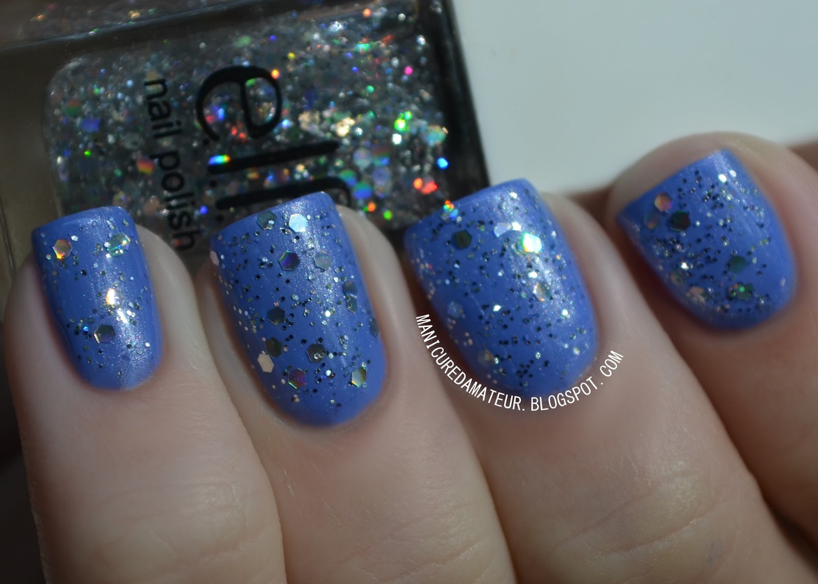
Lavender Mist is a bright periwinkle blue with silver microshimmer.

e.l.f. "Lavender Mist"


I assumed this was going to be a frost like the other two shimmers in the collection, but the brush strokes almost completely disappeared as the color dried. The brush did cause minor streaking, but two coats smoothed everything out. 

I'm a sucker for periwinkle, and a shimmery periwinkle is hard to come by.

e.l.f. "Lavender Mist"


Skinny Jeans is glossy blue creme.

e.l.f "Skinny Jeans"

This shade had the thinnest formula of them all, taking three coats to reach total coverage.

It's a pretty basic blue. There's no real wow factor here, but it does compliment the rest of the collection.

e.l.f. "Skinny Jeans"


Gold Star is a gold mix of fine and small hex glitters suspended in a clear base.

e.l.f. "Gold Star"

This is a great, basic, gold glitter mix depending on how you wish to use it. If you want to achieve the sprinkled look as I have demonstrated above, then this is a steal. The glitter sits so flat you don't even feel it when you run your fingers across the nail.

The reason behind this is also it's downside. The base is really thick. Unfortunately this means that it's extremely difficult to maneuver the glitter around and just about impossible to place a single glitter in a specific area. I basically had to dab it on and hope for the best.

I definitely like the end result, it's just shame that it's not more versatile. 

I know my photos are kind of funky, but since I'm back outside shooting (temporarily) I had to angle my hands down to avoid some major glare from the glitter. 

e.l.f. "Gold Star"


Dream Maker is a holographic mix of fine and small hex glitters suspended in a clear base.
e.l.f. "Dream Maker"


The formula for Dream Maker is nearly identical to Gold Star, but for some reason I had a much harder time getting the hex glitters out of the bottle. 

Even though it took some extra effort, I got the same beautiful result. 


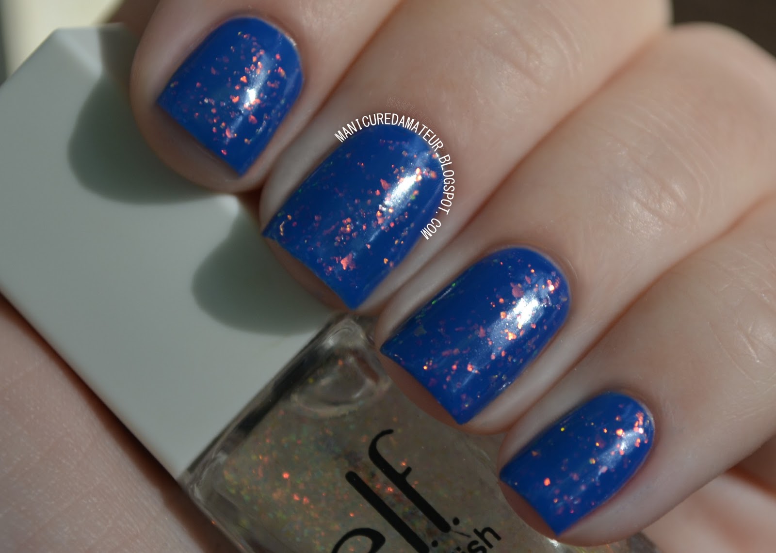
Fairy Dust/Cream consists of tiny, iridescent flakies suspended in a clear base.

e.l.f. "Fairy Dust/Cream"

As with all iridescent finish polishes, Fairy Dust/Cream is extremely camera shy without indoor lighting. That being said, the flakies are more sparse than other iridescent finishes such as Color Club's "Snow Flakes." 

This can actually be a good thing as it allows you to control the intensity of the effect. This was much easier to work with than the previous two mixes. I used two coats for the photos above, but this is in direct sunlight where the effect gets a bit lost.

e.l.f. "Fairy Dust/Cream"


Chic Confetti is colorful mix of round and small hex glitters suspended in a clear base.

e.l.f. "Chic Confetti"


Multicolored  glitter mixes like this are a dime a dozen, and this one isn't all that special.

The formula was a bit more manageable than Gold Star and Dream Maker, but not by much.

I don't hate it, I just have many others like it.

e.l.f. "Chic Confetti"


Overall


Now that I've seen the collection in its entirety, I'm more able to look past my qualms with the brushes. Losing hairs into the polish is still unforgivable, but once I got used to the behavior of the brush I was able to see the polishes for what the really are. 

For $14 dollars you get 14 polishes in a variety of colors and finishes. Deal or no deal isn't really the question here. Of course it's a bargain, but only if you like the colors. While some of the shades are pretty basic, a few stood out as my favorites:

Flirty Fuschia and Mango Madness still rank as my top two, but Mint Cream, Lavender Mist, and Fairy Dust are a few that I'm 100% sure I'll be turning to again.


What were your  favorite shades from the collection? 
Will you picking up this nail cube anytime soon? 
What about as a gift?


Let me know in the comments below and shout out your favorite gift ideas for the polish-loving mother figures in your life.


And don't forget to keep with the Manicured Amateur on Facebook, Twitter, Bloglovin' and all the other little social media outlets by clicking the buttons in the top right-hand corner.

Thanks for reading!

-Melody


Related Posts Plugin for WordPress, Blogger...