homeaboutcontactdisclosure

Sunday, March 31, 2013

Easter Chick Nail Art + Easter Pastel Pedicure


Happy Easter everyone!


So I had a completely different manicure planned for today, but just as the morning began the Easter Bunny stopped by to let us know that instead of giving us eggs he's delivering a baby!

My boyfriend's sister has gone into labor, so I needed a quick mani/pedi that was both Easter and new baby appropriate.


I couldn't think of anything more fitting than a hatched baby chick!


Colors Used:


Base: Avon Gel Strength Base Coat


Thumb: Julep Susie
Pointer: Zoya Kristen
Index: China Glaze Something Sweet
Ring: Loreal Tweet Me, China Glaze White On White, Sally Hanson Black Heart, Loreal Boozy Bruch
Pinky: Essie Love & Acceptance

Glitter Coat: Wet n Wild Hallucinate

Top Coat: Out The Door


I couldn't forget my toes!


As I'm on my way to the hospital to await the arrival of the newest member of our family,
 I hope everyone has a blessed holiday!


-Melody

Saturday, March 30, 2013

Saturday Snappy Swatch: butter LONDON Victoriana

Hi everyone!

Just a quick swatch today, but I think it's deserving of it's own post.

If you're an ULTA shopper, then you're no stranger to the "21 Days of Beauty Steals" promotion they are currently running. One day featured all butter LONDON polishes on sale for $9, motivating me to purchase this oldie-but-goodie beauty below: Victoriana.


Victoriana is a dusty blue flooded with silver micro-shimmer. I noticed it has the potential to lean a little more  towards a deeper blue-gone-teal in certain lighting, but it sparkles even in the lowest lighting situation. It's incredible.

Full retail price for one butter LONDON polish is $15. I know, ouch...but in this case you really get what you pay for. 

The formula and the brush are really what justify the price point here. The formula is fantastic. I have four butter LONDONs at the moment and they all have the best and most consistent formula out of all other brands I have so far. Why? It really holds to the brush. It's as if the brush has magical powers and only allows the perfect amount of polish to come out of the bottle, making sure you have complete control over the application.

Speaking of the brush, it's also one of my favorites. Relative to the Zoya brushes, butter LONDON brushes are small, skinny and stiff. While that's not some polishers' cup of tea, they're a dream for people such as myself who have small nails. I have grown to accept my small nails, but I can't escape the constant challenge of loose or wide brushes that fan out to the point that they become larger than my entire nail. It causes pooling and calls for large amounts of unnecessary cleanup and wasted polish remover.

Luckily, butter LONDON has yet to disappoint me. The formula plus the brush allowed for a one coat, smooth lined, no cleanup mani that's as fantastic as the shade itself.


What do you think of this shade and of the butter LONDON line? 
How much are you willing to spend on a single polish?

Share you thoughts in the comments below or let me know on my facebook and twitter.
You can also follow me on Instagram! (I'm finally getting the hang of it.)

Don't let the Easter Beagle steal all your eggs, and thanks for reading!

-Melody

Friday, March 29, 2013

Hard Candy Candy Sprinkles Collection Swatches and Review

Hard Candy Candy Sprinkles Spring 2013 Collection


Hi everyone!

Today I have the Hard Candy Candy Sprinkles Collection to share with you!

I know I'm a bit late to the party, but I couldn't pass up the chance to showcase such a fun collection.


The Collection


Hard Candy has recently expanded their entire nail polish line with 45 new shades, divided up into five collections: 

Crushed Chrome
Itsy Glitzy
Crystal Confetti
Glitteratzi
Candy Sprinkles

To see all of the collections from thw Hard Candy Nail Lacquer line, visit hardcandy.com.


The Candy Sprinkles Collection consists of the following nine glittery shades suspended in a milky, sheer or semi-sheer colored base:


From left to right: 
Pink Taffy, Peach Pop, Cotton Candy Pink, Sugar Rush, Gummy Green, Jelly Bean Blue, Sweet Tooth, Pixie Pink, Cocoa Smore


Price and Availability

Currently the Candy Sprinkles Collection is exclusively available for individual sale at Walmart and Walmart.com

The press release originally priced each polish at $3.97, but my local Walmart marked them up to $4.00. Needless to say I didn't cry over the extra 27 cents.


The Polishes


Hard Candy "Pink Taffy"

Pink Taffy is a medium bubblegum pink with magenta, black, and silver glitter.

Application was a bit thick but NOT goopy. The glitter was easy to work with, but appeared a bit sparse compared to some of the other shades.

If you prefer the jelly-like finish, you can do what I did and use two coats with just a clear base. If you want the pink to appear more saturated you can either add another layer, or apply a white or pink base beforehand. These polishes really give you a lot of control on the finished look.


Hard Candy "Peach Pop" 
 Peach Pop is a deep peachy-orange with red, orange, yellow an silver glitter. This has almost the exact same application as Pink Taffy, just a smidgeon thicker. The glitter is a more subtle due to the lighter colors used, and this can lean more orange than peach depending on lighting conditions.

I used two coats with a clear base above, but as with the previous shade, you can really control how opaque  you want the color to be. The application is smooth, so whether you apply thin or thick layers you won't run into any problems.


Hard Candy "Cotton Candy Pink"

Cotton Candy Pink is a trickster. It's technically a sheer baby peachy-pink with blue, black and silver glitter, but my skin tone made this come off as more of a peachy nude. I mean look how closely it matches. Mind blown.

The color is almost completely sheer on the first coat, and then takes a 360 turn and is almost completely opaque with the second coat with just a hint of visible nail line. Though it applies much thinner than the previous two, the glitter is denser.


Hard Candy "Sugar Rush"

Sugar Rush is a milky white with black and silver glitter. This was the first shade I saw of this collection and fell in love. The idea of white with black glitter is a concept I love and can match most everything.

It comes off pretty sheer with the first coat, with the color resembling dried Elmer's Glue. There is a significantly larger amount of glitter payoff with this one, yet it still applies smoothly and can easily be worked with to fill in any unwanted gaps. 

The second coat brings it to full opacity with no visible nail line. I really don't see a need to add a white creme base underneath, as this does the job all on it's own.

I do wish they had named it "Vanilla Bean" instead. I really makes me want ice cream.


Hard Candy "Gummy Green"
Gummy Green is a deep, jelly mint green with black and silver glitter. Glitter sammy in a bottle. The glitter even more jam packed than Sugar Rush, but muted by the milky minty goodness. (Am I hungry?)

Pictured above is just one coat. Oddly enough the application wasn't as think as Peach Pop, but is definitely the most saturated. To keep up with the "gummy" look I stopped here, but you want to eliminate the nail line, just add an extra layer or apply a white or mint base underneath.


Hard Candy "Jelly Bean Blue"

Jelly Bean Blue is a baby blue with black and blue glitter. I actually googled all the Jelly Belly flavors to see if I could find on that matched. The closest was tie between Plum and Mixed Berry Smoothie.

Nevertheless I think the name is appropiate, This has the most creme formula of them all, and was just a hair away from completely opaque on the first coat. The glitter payoff is about the same a Peach Pop, appearing a bit sparser than some of the others.

I swatched this the day before my index nail snagged on a dog collar nd had to filed down, so I think I'm biased at how nice I think the overall look is.


Hard Candy "Sweet Tooth"

Sweet Tooth is an odd, milky middle-of-the-road between indigo and lavender with pink, silver, and blue glitter. Despite not being able to figure out what color this is exactly, the combo is exquisite and extremely flattering. 

This has the sheerest application of them all and not as close to opaque on the second coat as the others. The glitter makes up for it as it's so incredibly dense.

The thin formula gives you a lot of versatility on where you want to go with the actual color. This could lean purple, pink, grey, or blue depending on what you layer underneath.


Hard Candy "Pixie Pink"
Pixie Pink is a spring-in-a-bottle lilac with pastel pink, blue and silver shimmer. This can transform into pinky lilac or even as far a lilac with different base colors, but I used a clear base above. 

This is pretty much opaque on the second coat unless you apply really thin layers. The glitter payoff is right in the middle of the entire collection and the application was the smoothest.


Hard Candy "Cocoa Smore"
Cocoa Smore is a milky taupe brown with black and silver glitter. Application was pretty thick but the glitter didn't seem to mind and applied evenly. It is completely opaque in two coats as pictured above.

This color makes me want to sip on hot chocolate and stuff my face with marshmellows. I makes my fair skin look tan and healthy and I just love it.

Overall


I had no idea what to expect of Hard Candy's nail line, but now I'm on my way to owning the entire thing.

I love the Candy Sprinkles collection as a whole. The combination of glitters and sugary shades do a great job of conveying the candy and sprinkles concept.

The formula overall is just fantastic. Although some of the darker shades were thicker, they were thicker in the right way to provide more color saturation. For glitter polishes, these are some of the best I own. The glitter is easy to maneuver and place as you like and honestly? Removal was easier than other brands...despite not wanting to take them off of course.

It was incredibly hard to pick a favorite, so I didn't. My two least favorites however were Pink Taffy and Peach Pop, just because they aren't my go-to nail color preferences.


Which is your favorite of the Candies Sprinkles Collection?
Have you or do you plan to try any of the Hard Candy Nail Lacquers?

Give me a shout in the comments below or on my facebook or twitter and let me know your favorites from the line!


Bonus: Outtakes!

So my lighting has yet to be consistent from post to post so I've been attempting to use a lightbox. 
Here's one of my not-so-helpful helpers deciding the lightbox needed more cat.

World, meet Rusko (or "Little Mister," which is all he'll answer to).


If you're wondering why he's wearing clothes, he compulsively scratches and grooms himself. His hair will fall out and he'll rub the skin raw and bloody. :( 
The vet just injected him with a bunch of shots that made him sick, so I took matters into my own hands. This is the only thing that has helped. He doesn't mind, I promise!


Thanks for reading and TGIF!

-Melody

Wednesday, March 27, 2013

It's Easter Beagle Snoopy Nail Art, Charlie Brown!


Hi everyone!

Today I have a quick post on my animated spin on a classic Easter egg mani.


I don't know about you all, but whenever a holiday rolls around, there's a Charlie Brown special on television. 
When Easter season arrives, instead of the Easter Bunny I think of the Easter Beagle...which is basically Snoopy galavanting around, stealing everyone's eggs and redistributing them on Easter Sunday.


From left to right: Avon Nail Experts Gel Strength Base Coat, CG Dance Baby, CG With Love, Loreal Broozy Bruch, Julep Sally, Essie Action, Nicole by OPI Ladies in the Limelight, Julep Freedom Polymer Top Coat, CG White on White, SH Hard as Nails Black Heart.


Starting with Avon's Gel Strength Base Coat, I layered two coats of China Glaze White On White as my base color, and added a layer of Nicole by OPI Ladies in the Limelight for my ring finger.

I used a small nail art brush and small dotting tool to paint the patterns of the eggs on my thumb, ring and pinky finger. To create a more cartoon-like appearence, I outlined the eggs with SH Black Heart and took an angled brush dipped in polish remover to create negative space along the tips and finish the egg shape.

Snoopy was freehanded using SH Black Heart with an added layer of CG White on White to erase any sketchy strokes.

I ended up changing my mind on the background for Snoopy. Instead on white, I layered thinned coats on Julep Sally, Nicole by OPI Ladies in the Limelight, and Essie Action until a smooth vignette was visible.

I finished the look with Julep's Freedom Polymer Top Coat. However, I think I've run it into the ground. Instead of creating the glossy finish it used to, in the past few days all of my mani attempts and come out smudgy, foggy, or rubbery.


Despite my topcoat woes, this look definitely makes me smile. And it gave me an excuse to watch cartoons.


What are you wearing for Easter Sunday? 

Comment below and Show me your Easter "egg-spired" nails on Facebook or Twitter.

Happy hump-day! (Is it just me or is that horrible phrase?)

-Melody


Monday, March 25, 2013

Avon Petal Impressions Collection Swatches and Review


Avon Petal Impressions Collection Spring 2013


Hi everyone!

Today I have Avon's Petal Impressions Spring Collection to share with you.

A family friend has been an Avon rep for a couple of years now, so I thought I would help her business by checking out both the limited edition and permanent collections. 

I previously owned a couples of polishes from the brand and was not impressed with the formula of the cremes. Word on the street is that the company reformulated the entire Nailwear Pro+ line, so I am willing to give it a second chance.

The Petal Impressions collection is comprised of the following six shimmery pearl shades:


Inspired Iris
Painted Peony
Sweet Pea Dreams
Garden Green
Forget-Me-Not Blue
Blue Water Lilies


Price and Availability:

The colors are available for individual sale through your local Avon representative or here on Avon's website.
Each retails for $6.00 each, but are currently on sale for $3.49! Avon offers free shipping with any $30.00 purchase, but there are often free shipping with $10.00 codes which is how I ordered mine.

If you don't personally know an Avon representative near you, you can go to the online Avon "Find a Representative" page here and either search for one in your area, or you can enter my rep's information and shop through her campaign online:

My Avon Rep: Julie Pruitt, Tennessee


The Colors

Avon "Inspired Iris"
Inspired Iris is a gorgeous cool-toned, rosy pearl pink with indigo and silver micro-shimmer. It applies a bit sheer compared to the others but is opaque in three coats. 

This has the most pearl-like finish and applies just as smooth. This has the best application of the entire collection and is a perfect pearly polish without leaning too far towards a frost.


Avon "Painted Peony"
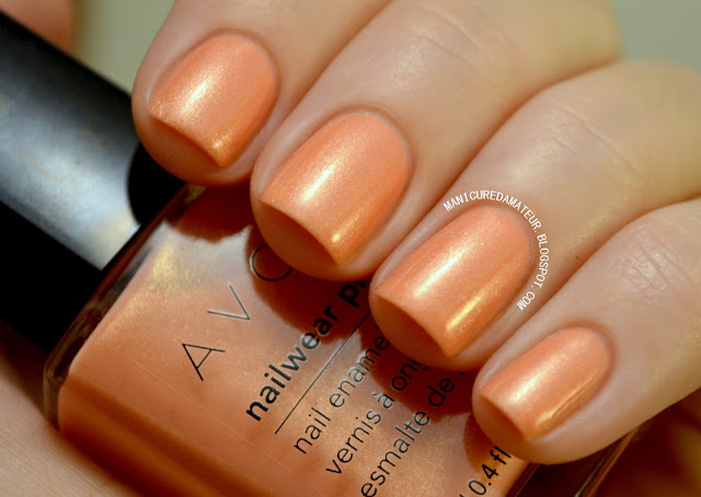
Painted Peony is a peachy coral leaning orange with golden shimmer.

It applies thicker than Inspired Iris, but goes on evenly. It's mostly opaque in two coats, but I added an extra  layer to eliminate the smallest hint of nail line that was still visible.

The golden shimmer is what makes this so beautiful. It just so flattering and complimented my skin tone completely. One of my favorite peachy corals to be released this year.


Avon "Sweet Pea Dreams"

Sweet Pea Dreams is a champagne-nude with golden shimmer. I really have mixed feelings about this. It's a beautiful color, but not on me. The warm undertones really emphasize any redness around the edges of my nails, and perhaps is just too light even for my fair skin tone. The shimmer tried to save it, but it just wasn't enough.

This was the only shade that gave me significant trouble with application. It thickens up rather quickly and brush strokes are more visible. That being said, it's easily hidden with an extra layer of top coat.

Alone it's a gorgeous concept. If you have more of an olive skin tone I think this would be extremely flattering, but more peachy pink beauties may be a bit disappointed.


Avon "Garden Green"

Garden Green is a deep forest green with silver micro-shimmer. I had a brain-lapse and forgot top coat, but I promise it has the same pearl finish as the others. It many other light situations this colors appears even darker.

It's application reminds me dead on of Zoya's Yara, which is almost the exact same color except with bright golden yellow shimmer as opposed to the shimmer. It's a one coater, thick but even with little effort..but there's something else about it that is so similiar to Yara I can't put my finger on. It's as if the micro-shimmer is so dense you can almost feel the resistance during application. It's not a negative experience, it's just...erm, unique?

Although this is a pretty basic forest green, the shimmer gives it its special something.


Avon "Forget-Me-Not Blue"

Forget-Me-Not Blue is the same situation as Garden Green, except blue. It's a cobalt-like blue with outstanding turquoise micro-shimmer. Like GG, this appears much darker depending on the light.

The turquoise shimmer is quite camera-shy, but in person it creates a perfect mermaid like palette. It's bolder than the rest of the collection and gives more of an aquatic viberather   than a floral one, but it's a great statement color.


Avon "Blue Water Lilies"

 Blue Water Lilies is a periwinkle blue with silver micro-shimmer. My absolute favorite, definitely out of this collection and possibly out of most of my recent purchases. It applies just as smooth as Inspired Iris, except it's opaque in two coats. The thickness of application is somewhere in-between Inspired Iris and Painted Peony.

I just can't stop looking at this color. It's subtle yet exciting, flattering, and versatile. It's fresh enough to fit the bill for spring and summer fashion, yet icy enough to stay appropriate during the winter holidays.


Overall

I would say Avon has stepped up to the plate, listened to customers and really improved. The formula is a thousand times better than previous shades of yesteryear and they're really making an effort  to release relevant collections that are on trend with the big dog polish brands.

The Petal Impressions set as a whole almost nailed it as a true collection, but not quite. Forget-Me-Not-Blue is just too far of a step away from a floral hue to remain consistent with the theme. Sweet Pea Dreams seconds that. It's lean too much towards a flesh tone to be reminiscent of flowers.
...Or maybe I just don't know my flowers. Not maybe...I really don't.

Individually these are great shimmery shades that are subtle enough to be appealing for any age group. The standouts for me are Blue Water Lilies and Painted Peony.


Which Petal Impression shade is your favorite? Have you tried any of Avon's polishes?


Let me know in the comments below, or as always you can share you thoughts on my facebook or twitter.

Thanks for reading!


-Melody

Saturday, March 23, 2013

Maven Madness: Julep Mystery Box Spring 2013


Hi everyone!

Today I have the Julep Spring Mystery Box to share with you.
(Note: Please pardon any lighting changes as I am transitioning to my new DIY lightbox for pictures.)


How It Works:

Almost every month, Julep offers a mystery box filled with $70 to $200 worth of Julep products. They offer multiple versions of the box, and each contain anywhere from three to seven polishes plus extra beauty items.


Price & Availibility:

Boxes are usually $19.99, but this box was priced at $24.99. 
You do not have to be a Julep Maven to order a mystery box, but Mavens will receive the benefit of free shipping no matter how many boxes they order.


This time around I received version one, which is the lowest value box you could receive.


Julep  Spring Mystery Box 2013 Version One


The Mystery Boxes look very similar to the Maven boxes in terms of presentation. The polishes were hidden inside a cute little drawstring bag with a light blue chevron pattern stamped on. It appears that everyone received a different color chevron pattern.


It has a gift tag attached, as I suppose it could be used a some sort of gift or favor bag...but I love it so much I'm going to be selfish and keep it for myself.


I also discovered it to be the perfect size to fit my phone, which is slightly larger than an iPhone. Bonus!


The Polishes

Julep Spring 2013 Mystery Box Colors

Version one of the mystery box contained three polishes, Camille being the limited-edition "mystery color" that is included in every version of the box.


Julep "Ashley"

Ashley is a frosty citrusy orange with goldenrod-ish micro-shimmer. While it looks obnoxious in both the bottle and the pictures above, in less direct lighting the orange is more understated and takes on a more burnt orange-brownish hue. Despite my horrible description, it's actually quite flattering.

That being said, this isn't a color I'd wear alone. However I already have ideas brewing on a few great fall/Thanksgiving stamping manis where this would be a fantastic base.

Retail Value $14.00 (Maven Price $11.20).
Note: This may be a discontinued color as it is not currently present on their website.

Julep "Lauren"

Lauren is described by Julep as a tropical hot pink creme, but it's actually a jelly! It applies very evenly and  dries to a satin finish as pictured above, but topcoat will bring it to a full gloss. I used three coats, but the nail line is still visible, even more so in person.

Lauren is such a girly pink and should be loved by many. I just love it, and funny enough...I really don't like pink. I've come a long way and have slowly incorporated it into my polish collection, jewelry and shoes, but I still won't wear it.

Retail Value $14.00 (Maven Price $11.20)


Julep "Camille" over Julep "Lauren"

Camille is a full-coverage iridescent glitter polish suspended in a clear base. It applies pretty evenly due to the density of the glitter and dries pretty quickly. Pictured above is just one coat over three coats of Lauren. My camera about died taking these so focusing was a challenge. Forgive me. :(

Retail Value $14.00 (Maven Price $11.20)


The Beauty Item


Included was a 89mL, 3 fl oz tube of Julep's Daylight Defense Sunscreen for Hands and Face with Vitamin E. It's creamier than the average sunscreen, and dries in a way that makes you skin feel sort of stiff yet hydrated. It smells of a mixture of oranges and that signature sunscreen smell. It's pretty subtle unless you stick your hands directly under your nose.

Georgia decided to throw a tantrum and gave us tornadoes on Monday (greenest sky I've ever seen!), and then sleet every day after up until this very moment. Needless to say I've stayed indoors and can't comment on how this holds up throughout the day. However I do want to point out that it is labeled as not waterproof and requires reapplication, so this isn't your go-to beach survival sunscreen. This is more of your before makeup, extra protection sunscreen.

I'd be happy to keep you updated on how effective this product ends up being. Georgia weather is pretty bi-polar this time of year, so I expect us to be reaching 80 degree weather any day now and making sunscreen mandatory.

Retail value $28.00 (Maven Price $22.40)


The Extras


These little hair ties are apparently all the rage and appeared in all versions of the box. I already had some from the Nudes&Neons January Maven box, but it's always nice to have more considering these are also all the rage with my cats!


The box also contained one packet on what claims to be ten polish remover pads. I am saving these for travel so I haven't opened them. The package isn't all that large so they much be pretty small pads to fit ten inside. They are labeled as lint free and infused with aloe to condition as you remove polish.

Retail value $9.99 (Maven price $7.99).


Last but not least is a standard-size emory board. There is no indication as to what size grit each side is, but the side without the "julep.com" logo (right) is significantly rougher.

These flimsier type of boards aren't my go-to file, but they are really handy for travel. Everyone needs at least one...or three, ha!


Overall


Overall Retail Value = $79.99  (Regular Maven Price Value = $63.99) Minimum.
Does not include cost of Emory board, hair ties and bag.


I can't say I'm not bummed I didn't get a higher value box, but in the end I got a box containing two colors I didn't previously own, a versatile glitter topcoat, a skincare product you can never have too much of, and some handy extras to prepare for warmer weather. Even though this was the lowest value box, the price point was reasonable in comparison to a normal Maven box.


Speaking on Maven boxes, selection window for this month is open until tomorrow!

If you interested in becoming a Julep Maven, now's the time to sign up! If you're still on the fence, check out my in-depth review of the entire Maven program here.

You can sign by following my referral link here and get your first box for just a penny plus free shipping!
Just enter code "PENNY" or "JULEPVIP" at checkout.
You can cancel at any time, so for one cent you've got nothing to lose! Except that penny, which if you're like me you lose a bunch of those anyway. -_-


Do you think the price matches the value of these boxes? 
What is you experience with the Julep brand?

Let me know in the comments below or give  me a shout on my facebook or twitter.

Hope you're having a splendid Saturday. Thanks for reading!


-Melody

Friday, March 22, 2013

China Glaze Ombre Collections Review + Gradient Swatches


Hi everyone!


Today I want to discuss the release of the new Ombre Collections by China Glaze.

There are three collections in total, each containing four FULL size polishes, ten porous sponges and directions to achieving the gradient effect.


First, I want to mention that I chose not include individual swatches for every color. Why? Every color is a pre-released shade and a part of the permanent collection. There are some great staple China Glaze colors here and some cult favorites such as Aquadelic, Grape Pop, and the holy grail of China Glaze colors: For Audrey.

You can google search any of the included colors and come up with dozens of swatches from other polished lovelies, so I'll skip that step here.

I have turned my attention towards the curation of the shades . How well do the colors go together? How do the finishes of each polish effect the gradients? 
If you're wondering the same thing, keep on reading!


The Sweet Sensations Kit


The Sweet Sensations collection includes the following the shades:

Angel's Breath: A semi-sheer off white with pink undertones, originally from the United in Purpose (Breast Cancer Awareness) 2012 Collection .
Something Sweet: A pale baby pink creme, originally from the Up & Away Spring 2010 Collection.
Dance Baby: A bubble gum pink with purple undertones, originally from the Electropop Spring 2012 Collection.
Make An Entrance: A classic medium pink with blue undertones, originally from The Creme Couture 2004 Collection! Most likely reformulated, since it's original release was before CG went "big 3 free."


This kit gave me the most trouble creating the gradient for two reasons.

I put the blame partially on Angel's Breath. It applies much thinner than the other shades in this kit, so it's blending impact is severely reduced.

The other reason, and more importantly is that the value of Make an Entrance varies too far from the others. It's much darker. While I seemed to have worked for my middle finger, four times out of five I just couldn't get it to "mesh" with the lighter shades.


The Wait Teal You See! Kit


The Wait Til You See! kit contains the following shades:

White on White: A great basic bright white creme a  part of the Core Collection.
For Audrey: You've seen it everywhere. The true Tiffany-inspired turquoise from the Something Blue 2007 Collection. A nail junkie's must-have.
Aquadelic: An aqua blue creme with a slight green tint. Almost the same as For Audrey, but not quite. Originally from the Electropop Spring 2012 Collection.
Turned Up Turquoise: a satin-finish bright turquoise with micro-shimmer, originally from the Wow Factor/Nervy Neons Summer 2006 Collection.


Yeah, I nailed this one. Oddly enough I was expecting this one to give me the most trouble, but it gave no trouble at all.

I assumed the middle "section" would be too prominent because Aquadelic and For Audrey are so similar. I was wrong. Sometimes three color values are all you really need. The shades in this kit all had the exact same formula and blended perfectly, with minimal sponge markings I like to refer to as "static."

I was hesitant to even use Turned U Turquoise due to the presence of the micro-shimmer. I assumed it wouldn't blend properly and you'd really notice where the shimmer began. CG got me again. The shimmer is nearly non-existent in person just as it is in the picture above.

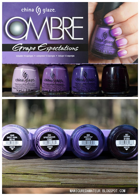
The Grape Expectations Kit


The Grape Expectations kit contains the following shades:

Sweet Hook: A light pastel lilac creme originally from the Electropop Spring 2012 Collection.
Spontaneous: A classic purple creme, originally from the Flirt 2010 Collection
Grape Pop: A warm toned violet creme with blue undertones. Does that make sense? Originally from the Up & Away Spring 2010 Collection.
Crimson: A blackened-out, vampy purple creme, originally from the Haunting Halloween 2011 Collection.


I have mixed feelings about the curation of this kit. While the difference in shades isn't quite as severe as the Sweet Sensations set, there is still a stark contract between the lightest and darkest shade.

Crimson is so incredibly dark that any "static" is immediately emphasized, which is why I think the gradient wasn't as smooth as the other two.

Also, I have one point I'd like to mention concerning Sweet Hook. It is a lilac, not a lavender. While it's seems to have hidden its pinky undertones in the picture above, in some lighting I just couldn't look past it. While a pink to purple gradient is pretty too, these kits are advertised as "ombre" shades, meaning they are corresponding values of the same color. In short, it needs to be purple...not pink.


The Sponges


Also included inside each box are ten hexagonal flat sponges to assist you with the gradients.


I don't really have much to say about the included sponges, because I didn't use them. Honestly, it's just because I were forgot they were in the box.

You will noticed that they are much more porous compared to the sponges I used, which are barely porous at all. Many polished lovelies prefer more porous sponges, claiming it creates a better gradient. I'll have to try it next time to know for sure, but unfortunately outside of these kits I have a hard time locating any sponges other than the dense ones pictured above.
If you know where to find them, let me know!


Overall


The question is here is not whether or not you should buy these sets. Of course you should. $12.99 for four full-size CG polishes + sponges? You do the math. That's a steal. Even if you own some of the colors as I did, they are great staples colors that won't hurt to have backups of.

The question is how they perform as an all-in-on gradient set. As an ombre set, sure. You'd get away with one color on each nail easily. When attempting the gradient, Try experimenting with your combinations and switching out either the darkest or lightest shades in either the Sweet Sensations or Grape Expectations kit. The Wait Til You See kit on the other hand, is a complete success.


Did you pick up any of these sets? Which one is your favorite? What do you think of the gradient trend?

Let me know in the comments below or share you thoughts with me on my facebook or twitter.

Oh and TGIF!

-Melody

Sunday, March 17, 2013

Polish for Paddy's Day! St. Patrick's Day Clover Manicure

Happy St. Patrick's Day everyone!

It's been a rough week in my household.
My boyfriend, roommate and I all caught a horrible stomach virus that left us delirious, nauseous, unconscious or a combination of the three for the majority of the week. 

So if you're like us and aren't much in an "all-out partying for Paddy" kinda mood, you can still create a subtle-but-spirited mani that won't get you pinched.
(Who came up with that horrid tradition anyway?)


Colors and Tools Used:


Steps


After applying one layer of Avon Gel Strength Base Coast to all nails, I applied two coats of Julep Adrianna for my base color.

I then took the small dotting tool and placed two dots of Julep Fiona and dragged then down into a heart shape to create a leaf. I repeated the steps on each side of the original "leaf" to complete the clover.

After randomly painting clovers on the nail, I used the small nail art brush to touch up the edges of the leaves and ensure the clovers were smooth and opaque.

I then took the same nail art brush and dabbed on a thin layer of Julep Colbie.

For my ring finger I made a jelly sandwich beginning with a thin layer of China Glaze Budding Romance. Scraping off most of the glitter off of the brush, I layered a very thin coat of Julep Colbie (normally very full coverage) on top of CG Budding Romance. Next I added a second layer of CG BR to complete the sandwhich.

Following the same steps for the other four nails, I randomly painted clovers with Julep Adrianna all over the nail and touched up with the small nail art brush.

Finally, I took a small angled brush to clean up any stray polish on fingers and cuticles and topped the design with two coats of Julep Freedom Polymer Top Coat.


This is my first time-intensive design in a while. I obsessed over touch and clean up knowing I was going to take photos, so I'm satisfied with it.
The greens make my hands look a bit pinker than usual, but for a holiday I can suck it up.


What do you think of the pattern? Did you party for Paddy?
Comment below or let me know on facebook or twitter. Thanks for reading!

-Melody

Related Posts Plugin for WordPress, Blogger...