


homeaboutcontactdisclosure
Showing posts with label green. Show all posts

Saturday, June 29, 2013

Indie Spotlight: Femme Fatale Swatches and Review


Hi everyone!

I know what you're thinking, "WHERE HAVE YOU BEEN?!"

Four days without sharing my nail adventures with you all has incredibly hard.

With the packing and moving well underway, I've had no choice but to devote all my time to emptying the house.
We expect to be fully moved into our new home by the end of next weekend and I can not be more excited.

You all have been incredibly supportive during such a hectic time, and I cannot thank you enough.

Even though my hands have been overworked, beat up and reak of cardboard, I haven't stopped polishing.
I'm been testing a lot of new nail products include strips, press-ons, and new nail care items,
but my shining stars for the week have been none other than my new beauties from Femme Fatale Cosmetics.

Femme Fatale Cosmetics is one of the most highly coveted Australian indie brands and international distributors.
Femme Fatale Cosmetics are quality tested and 3 Free.

All of the stress and exhaustion of this month immediately melted when I received notice that I'd have the opportunity to share a few of their polishes with you all.

Today I have four of the following glittery shades:


From left to right:

Eventide
Jadefire
Keeper of the Grove
Suspended Starlight


No more jibber jabber, let's see 'em!


Jadefire is a yummy mix of coral, red, green, and gold hexes of different sizes, along with red and gold fine glitter in shimmery yellow-green tinted base.

(One coat shown over Sinful Colors "Unicorn.")


The base is very thin which allows this to easily be built up on it's own or worn over a base color.
The glitter is a bit clumpy on the brush, but spreads easily and does not require dabbing.

To reach full opacity on it's own you'll need three coats and will result in a more muted, darker yellow-green.

I chose a base to saturate the color, but I recommend choosing a shade as close to the yellow tint as possible, otherwise a bit of patchiness may show (intentionally displayed in the second photo).


Something about this combo makes me crave a fruit salad.
I have no idea how that relates to the name Jadefire, but who cares!

It's a smart choice of colors that can be appropriate for spring, summer and even fall, and is unique to my collection thus far.


Keeper of the Grove is a slightly green-tinted shmmery base packed full of all sorts of different glitter: 
from tiny green and gold hexes to small blue and fuschia round glitter, slightly larger gold and fuschia hexes and even large pink hearts!
(One coat shown over Fingerpaints "Tough Art To Follow.")


This one is definitely a full coverage glitter, but can still be used as a topper if so desired.
Most swatches I have seen of this shade use a matching lighter green as a base, so I thought I'd change it up with a darker shade to fully emphasize on just how diverse this glitter mix is.

Like Jadefire, the base is thin and the tint is extremely subtle to the point that it almost isn't there.
The glitter is very dense, but still doesn't need dabbing.
Fishing is necessary to obtain the hearts, but because the base is so thin it's not a big effort.


This is absolutely beautiful.
Whether or not you catch the possible gaming inspiration behind the name, the combination is simply a winner.


Eventide is a feminine mix of fuschia and gold glitter of all shapes and sizes -- small and medium hexes and small and large squares all stirred in a clear base.
(One coat shown over China Glaze "Purr-fect Plum.")


The base is slightly thicker than the previous two, but not by much.
The formula is pretty much perfect proven by the fact that I didn't even have to fish for the large squares!

The only important note to make is that a top coat is a must. 
Without one or two good layers, the top layer of the square glitters will begin to peel off if snagged or meddled with too much, leaving you with just the patchy holographic underlayer.


The options are endless with this one - light base, dark base, no base or jelly sandwhich, you can do it all.
It's so sparkly and regal and I can't get enough of it.


Suspended Starlight is blue jelly packed with turquoise and deep royal blue shredded, fine, small and medium hexes, along with large silver moon and star glitters!
(One coat shown over Sally Hansen Xtreme Wear "Pacific Blue.")


This has the most prominent base out of the four, and can definitely be built up on it's own.
Like Eventide, a top coat is required to prevent the moon and star glitters from peeling away.
Fishing isn't really necessary for them either, unless you have a specific placement pattern in mind.


 Are you as over the moon for this one as I am?
Even at one coat this has so much depth and and is the perfect emulation of a twinkling night sky.


Overall I think that Femme Fatale Cosmetics are carefully thought out color combinations that are sure to catch attention.
With so many ways to wear each shade you'll love them more and more with every mani.

With one of these is your favorite?
Let me know in the comments below and give them some love on Facebook, Tumblr, Instagram, and Pinterest!


Want Femme Fatale Cosmetics for yourself?


To see the entire line of Femme Fatale Cosmetics and to see the other available artisan lines carried, you can visit Femme Fatale's website.

While purchasing Femme Fatale Cosmetics through their website is only available to Australian lovelies,
the rest us international beauties can see access stocklists through the following carriers:

United States
Llarowe - $13.00 per full size 12ml bottle.
(Currently carries Eventide, Jadefire, and Keeper of the Grove)

Canada

Harlow & Co. - $13.50 per full size 12ml bottle.

Singapore

Shop Ecclectico - $18.00 per full size 12ml bottle.
(Currently carries Jadefire)
 **Participating Austrailian brands currently 20% off (FF currently priced at $16.00)!

Norway

Norway Nails - NOK159 per full size 12ml bottle.
(Currently carries Eventide, Jadefire, Keeper of the Grove and Suspended Starlight)

France

Ledouxnage - € 8.64 - € 14.40 per full size 12ml bottle.

No matter where you go to shop, you will notice these babies sell fast,
so make sure to keep up with Femme Fatale on Facebook, Twitter and Instagram for restocks, new releases and more.


Thanks for reading!

-Melody

Tuesday, June 18, 2013

Avon Cosmic Collection Swatches and Review (Part Two)


Hi everyone!

I want to continue on with the second half of the Avon Cosmic Collection.

If you didn't warm up with the hot shades from the other half, just click the images below to see the rest of the colors along with information on pricing and availability.


Let's move on and cool things down with the icier shades from the collection, shall we?


From left to right:

Moonbeam
Celestial
Galaxy
Aurora
Eclipse


The Colors


 Moonbeam is a silver scattered holo.


Silver holos never disappoint, and under the sun this one is the exception to the "bolder the shade, bolder the holo" pattern this collection possesses.

You can almost see a faint, faint, super faint linear prism at the angle shown in the first photo.


All that holo goodness disappears indoors, but the shimmery silver that's left might just be one of my new go to silvers. 
The formula is just too good to let sit on the shelf.


Celestial is either an icy mint shimmer or a light, teal green with holographic shimmer.


When you look at it outdoors, it's more of the latter. 
The color is much bolder and the scattered holo really shines.


Indoors the color seems to lighten up, taking on a more pastel, minty hue with any icy shimmer.


Galaxy is a bold cerulean blue, with what's supposed to be holographic sparkle.


I was surprised at the hidden the holo is in this particular shade. 
Indoors or out, it just isn't really there unless your hands are positioned in the right way in the right light.


It's such a pretty color either way, does it even really matter?


Aurora is a scattered holo that shifts from violet to purple.


This is the only one that the camera disagreed with just a tad.
The holo is a tad stronger than what is pictured. 
Unfortunately, after rephotographing this shade TWICE the camera came up with the same results.

(Anyone else having Barney flashbacks when looking at this shade?)


This shade is another shape-shifter once you get inside.

While in the sun it's more of a violet, indoors it takes a step to the cooler side of the color wheel and becomes more purple. It also loses the holo, following suit with the others.


...and finally we have Eclipse, a teal going on black with obvious holographic sparkle.


I don't have to justify the holo here, do I?
This shade sparkles better then the twinkly Twilight vampires ever will.

(I apologize for offending at least 75% of you all with that one.)


I know what you're thinking though: "Are you sure that isn't just black?" I'm sure.
It'll look black on the nail while inside, sure. Before you even get to that point you'll notice the teal tinge to the color the second you open the bottle.

Personally I love it so much more this way.
It's so gorgeous and mysterious.


Overall


I applaud Avon for going out on a limb and trying a finish that's a bit ambitious for  a brand that doesn't technically specialize in nail polish.

The holographic is nothing compared to just about any other brand's version, but in fairness this collection was advertised as having a "holographic pearl" finish. To me, this implies that it's intentionally more subtle. If that's the case, then they succeeded.

Holographic or not, these shades are stunning -- every one of them.
They are all eye catching and catch the light both indoors and out.

As far as being cosmic? Well...the formula is certainly out of this world.


What are you favorites from all of these holo hues?
Will you be adding these to your list of shimmery lemmings?

Let me know in the comments below and make sure to give these shades some love on Facebook, Instagram, Tumblr and Pinterest.

Big changes are happening soon here at The Manicured Amateur.
If you're not already, now there's time to be following on Twitter and Bloglovin' for all of the updates.

Thanks for reading!

-Melody


**Products in the post were paid for by me with my own money.
I am not an Avon representative but am proud to encourage readers to order through Julie Pruitt, a long time family friend.

Friday, June 14, 2013

Sally Hansen Sugar Coat Texture Collection Swatches and Review


Hi everyone, TGIF!


You asked for it, and you got it!
I asked my Facebook fans to choose between the Sally Hansen Sugar Coats and The Avon Cosmic Collection for my next post.

At the time I went to bed it was a tie, but SH was voted first so I went with these.
In truth, Avon ended up getting an extra vote after I started, oops. That's up next, I promise!


It took me awhile to actually find this collection near me, and I stalked CVS everyday until they put out the display.
It paid off! I scooped every single one before anyone else knew they were even there. 


The Collection


The Sugar Coat Collection is Sally Hansen's take on the texture trend, consisting of the following eight 3D matte shades:

From back left to back right:

Sugar Fix
Cherry Pop
Bubble Plum
Cotton Candies
Sweetie
Sour Apple
Razzleberry
Lich-O-Rich

The Sugar Coat collection can be found in most Walgreens, CVS, Rite Aid, Target, and Walmart locations and usually range from $5-6 each.


The Colors

All of these have the exact same formula.
While all except for Sugar Fix and Sweetie can be left at one coat, it is recommended to use two. If left at one the sugary finish may appear patchy and not evenly develop.
(I use one coat on all except Sugar Fix and Sweetie to demonstrate.)

The actual texture is a matte, but the base is not.  I actually prefer it this way as it emphasizes the effect.


Cherry Pop is literally a bright cherry red.


Cotton Candies is a bold bubblegum pink.


Bubble Plum is a fuschia like purple-pink.


Sugar Fix is a stark white.


Sweetie is a banana yellow.


Sour apple is a bold mint green.


 Razzleberry is a rich cerulean blue.

WARNING: This one stains horribly. I only wore it for five minutes and faced a whole day of stained cuticles after removal.


 Lich-O-Rich is black, but the texture makes it appear more charcoal.
This one best displays what happens if left at one coat.


Overall

I'm pleased with the collection for the most part. 
As rich as the colors are I wish the texture would have held at one coat. 
It's a minor concern considering applying two coats is an easy step for fast drying textured finishes.

My only disappointment is in Razzleberry, which would have been my favorite had it not been such a pain in hiney. 
Staining is a major thumbs down for me, but at least it was only bad one in the bunch.

In general I still prefer my textures to have a bit of sparkle, but these are cute basic colors and are a great option if you're short on time.


Which is your favorite of these sugary shades?
Have you hopped on board the texture trend train?

Let me know in the comments below or share your thoughts on Facebook, Twitter or Instagram.

Coincidentally, this month's theme for Sally Hansen's I Heart Nail Art Challenge is textures!
For more information on how to enter and the prizes you could win, visit here.

Thanks for reading!

-Melody

Sunday, June 9, 2013

Maven Madness Boho Glam Box + Nan Add-On June 2013


Hi Everyone!

A new month means a new Julep Maven box, and this month is all about preppy-chic summer style.
This time around I went with the Boho Glam option with an It-Girl add-on.


The Box


Julep Maven boxes are delivered right to your door every month for $19.99 and usually include two polishes, a beauty item, and one or two random extra gifts.

For a more details on all aspects of the Julep Maven program, read my in-depth review here.


The Colors

The Boho Glam box included two shades in "Dianna" and "Lexi."


Dianna is a light, seafoam green creme.


Childhood on my nails.
When I was younger, my mother had my walls painted this exact color with all white wicker furniture.
Oh the 90's southern cottage style.

Not only am I partial to this shade from a nostalgic perspective, but it's just gorgeous.

It's rich  and creamy and the formula is great.
It's thicker than the other two, but just thick enough to apply smooth and opaque in just one coat.

This is a true seafoam green without being muted or leaning towards a more minty hue. Love it!


Lexi is a bright yellow creme.


I think we have a winner for best true yellow ever, at least in my collection thus far.

Let me make my broken record statement in saying that all bright yellows have a streaky formula to some extent.
However, this one had the least amount of streaks, and what streaks it had evened themselves out during the drying process. 
Just to make sure  it was completely even, I used two coats.

It's super bright without being super  pastel or super green.
This is seriously the yellow you need.


The Beauty Item

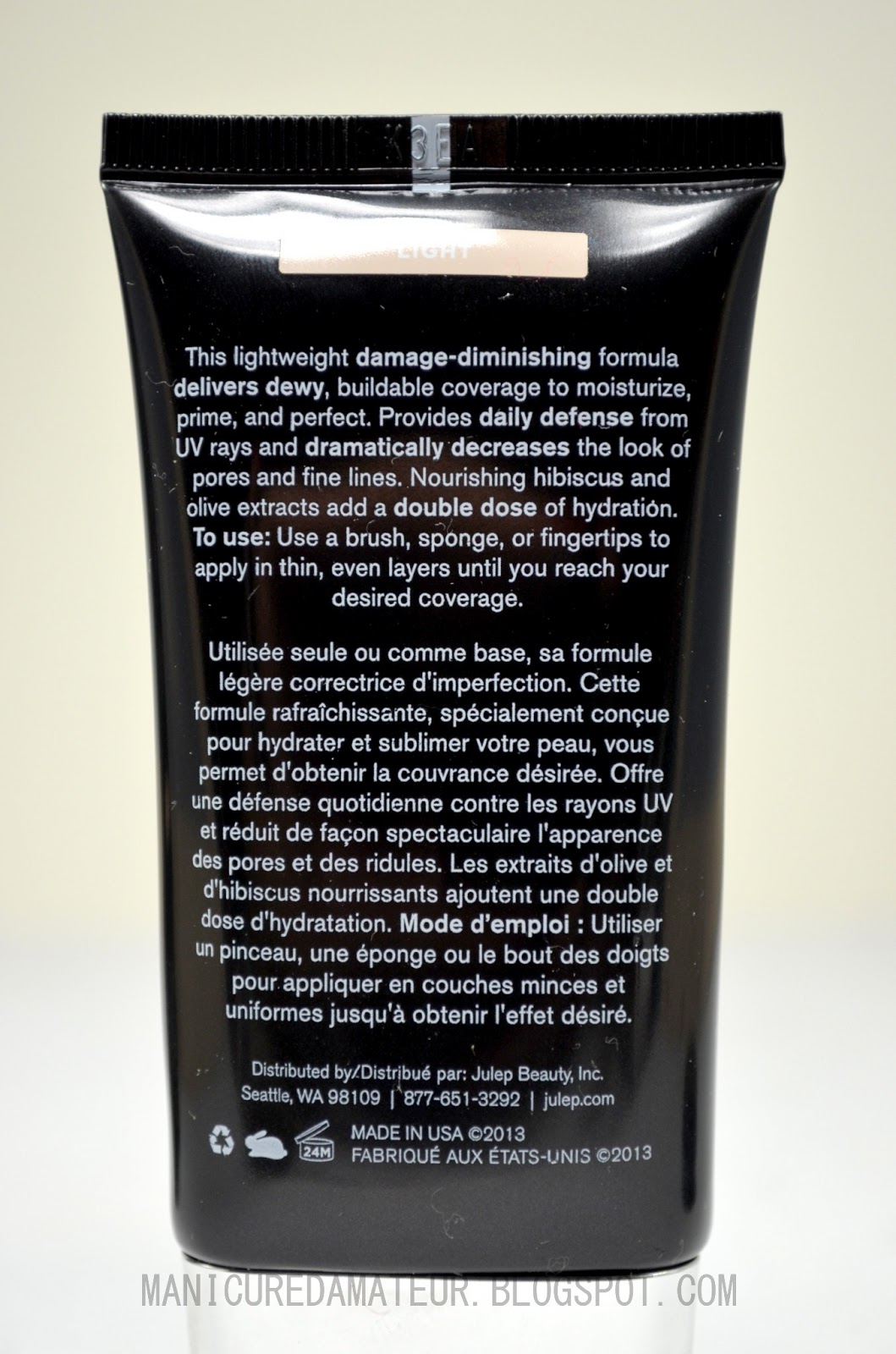
This month Julep debuted their first face makeup product, the DD Creme.


The DD Creme is available for the retail price of $28.80 and is available in four tones:

Light
Medium
Medium-Dark
Dark

Being the Casper face that I am, I received mine in "light."


The product is advertised to be "dynamic do-all" solution to help prime, perfect and protect the face with a lightweight formula with buildable coverage.


Ugh.
There's been a huge amount of drama revolving around this product since it's release.
Julep has been flooded with criticism by the majority of Mavens.

Not in the know? Let me sum up:

1. There is little to no product in the package.
2. The "light" version is way too dark and way too orange.

Some Mavens even resorted to cutting open the tube at the top to prove how empty the package was.
I didn't go that far, but the shot below hopefully conveys how much the bottle had to be squeezed to release the product upon my second "use."


Yup, it's almost gone.


But is it as dark and orange as other Mavens claim?
Let take a look.
Below shows the product swatched on the under side of my arm, the area that most closely resembles the lightness of my face.
(Pasty skin for the win...not)


Looking at that photo alone will turn people away.

So what happened when I blended it?


 I mean, the amount of orange is tame compared to any cast member of the Jersey Shore,
but it's definitely too dark and too wrong.

The color is actually not my main concern. 
Even mismatched face products can be minimized with the right powder, highlighter, etc.

My dismay for the product lies is how awfully oily it was.
So much so, that I could not bare to have it on my face long enough to take a  full face picture for you all.

In all fairness I have combination skin but GURLPLZ, this was ridiculous.
Had I left it on any longer I would have surely broken out, and that is far from "perfect" as the product was advertised.

The debate continues on, as customers with darker skin tones seemed to have been more satisfied than us lighter skinned ladies who apparently are SOL (excuse my rude abbreviation).

In the end, the mass of Mavens are displeased with the miscommunication and possibly misleading advertising about this creme. Although Julep clearly marked the tube to contain 1oz of product, for the price point it either needed more product  or a second thought on the package design.

I am not in a completely state of disappointment because I never fell victim to the hype of CC, BB, or any other alphabet creme.

Apply sunscreen, apply foundation lightly, and save your money. It's the same thing.


The Extra

To fit in with the beachy theme, this month's little extra was a few bits of Salt Water Taffy.
(All consumables included in Maven boxes are accompanied with an ingredient list and allergen warning.)


 They look sweet, but I'm not a taffy person myself.
My roommate on the other hand is a sucker for salted candy anything, so I was happy to pass them along.

His review? "The strawberry is where it's at." Haha, men.


The Add-On

Interesting enough, this was the color I was most excited about.
The rest of It Girl option wasn't calling my name, but I just couldn't pass up the chance to add-on "Nan."


Nan is described as a "Nantucket red."
Basically, it's a shade of red that looks faded, almost to a dusty rose.


If you're rocking shorties, you could probably get away with one coat, but in most cases the nail line will peek through. 
I recommend two layers as shown in the photo.

I am simply smitten over this color and is possibly one of my favorites Julep has released this year!


Overall

When it comes down to it, the colors popped and the DD creme flopped.

I applaud Julep for trying something new, and in their favor their hand cremes and other beauty items are fabulous. Unfortunately the DD Creme just couldn't live up to the hype.

Matters aside, I'm in it for the polish as most of us Mavens are.
The colors I received were great quality and complimented the theme well.
The yellow is astounding, the seafoam is dreamy and the red is unique.

If you're still on the fence about joining the Julep Maven program, don't let the DD debacle deter you from becoming a member. 
I've been a Maven for over a year and it's been worth ever penny.


What was your favorite shade from this month's box?
What  are you thoughts on the coveted cremes of the alphabet?

Let me know in the comments below or give me a shout on Facebook or Twitter.


If you're not currently a Maven, now is the time!
The selection window for this month opens in 11 days, so join now with my referral link below and get your first box free!
 I think you have to pay shipping now, but it's still worth it!

http://www.julep.com/rewardsref/index/refer/id/45305/

If the link has not already filled it in for you, enter my referral ID# 3488485 and then enter promo code "FREEBOX" at checkout. It's that easy!

---

Speaking of free, I'm having a GIVEAWAY!
Once I get to 500 likes on Facebook, I'll be giving out prizes to a couple of lucky readers.
More details to come closer to when the goal is reached.

You don't want to miss out, so if you're not already, follow me on Facebook, Twitter, Instagram, and Bloglovin' for all the happenings here at The Manicured Amateur.

Thanks for reading!

-Melody
Related Posts Plugin for WordPress, Blogger...