homeaboutcontactdisclosure
Showing posts with label sinful colors. Show all posts

Thursday, July 4, 2013

Happy Independence Day! 4th of July Nail Art


Happy Independence everyone!

The weather is icky and I'm busy packing.
Even though I can't join in on barbecues, bonfires and fireworks I thought I'd still get in on the nail art festivities!

I got up early to work on my 4th of July nails, and let me tell you it took me over 6 hours!
I changed my look about four times before settling on something simple.


My thumb is is a two layer base of Sinful Colors "Snow Me White" with a simple glitter gradient of Julep "Fireworks."

My index finger is one layer of China Glaze "Adventure Red-y" with a large silver star from my Born Pretty Store Stud Wheel.

My pinky finger in two layers of La Girl 3D Holo "Brilliant Blue" with another large stoar from BPS.


Now the glitter placement on my middle finger took incredibly long.

Before I began, I painted two coats of LA Girl 3D Holo "Brilliant Blue".
Not having any glequins around, I reached for My Pink Dreams "Casa Blanca" and individually fished and placed each hex glitter until I reached exactly 50 to imitate the stars on the American Flag.
I sware, it had to have taken over an hour as I kept losing count. Haha!

My ringer didn't take as long.
I began with a two layer base of Sinful Colors "Snow Me White" and then placed 6 evenly spaced pieces of nail tape over the nail.
I then painted over the gaps with LA Girl 3D Holo "Sparkle Ruby" and removed the tape to reveal 13 stripes in total matching the stripes on the American Flag once again.


Overall it's a simple, wearable option for any patriotic outfit.
I had more intricate, over the top designs half finished...but sometimes less is more.

What do you think of the 4th of July look?
Did your nails show your patriotic spirit today?


Let me know in the comments below and send me your 4th of July nails on Facebook or Twitter!
And don't forget to give this look some love on Facebook, Instagram, Tumblr and Pinterest!

---

I apologize for being short of words this week.
I officially begin moving into my new place tomorrow.
I tried so hard to post regularly, but I know I've been bad and disappeared for one, to up to four days at a time.

After this weekend, things will be back to normal. 
I promise!

Meanwhile, I've reached over 500 followers on Instagram,
almost 1000 on Tumblr,
and approaching 500 on Facebook!

I cannot thank you all enough for your support.
Once I'm officially moved and settled, I'll be scooping up prizes for a huge giveaway to thank you.

You all are truly lovely and amazing.

Thanks for reading, be safe, and have fun tonight!

-Melody

Monday, July 1, 2013

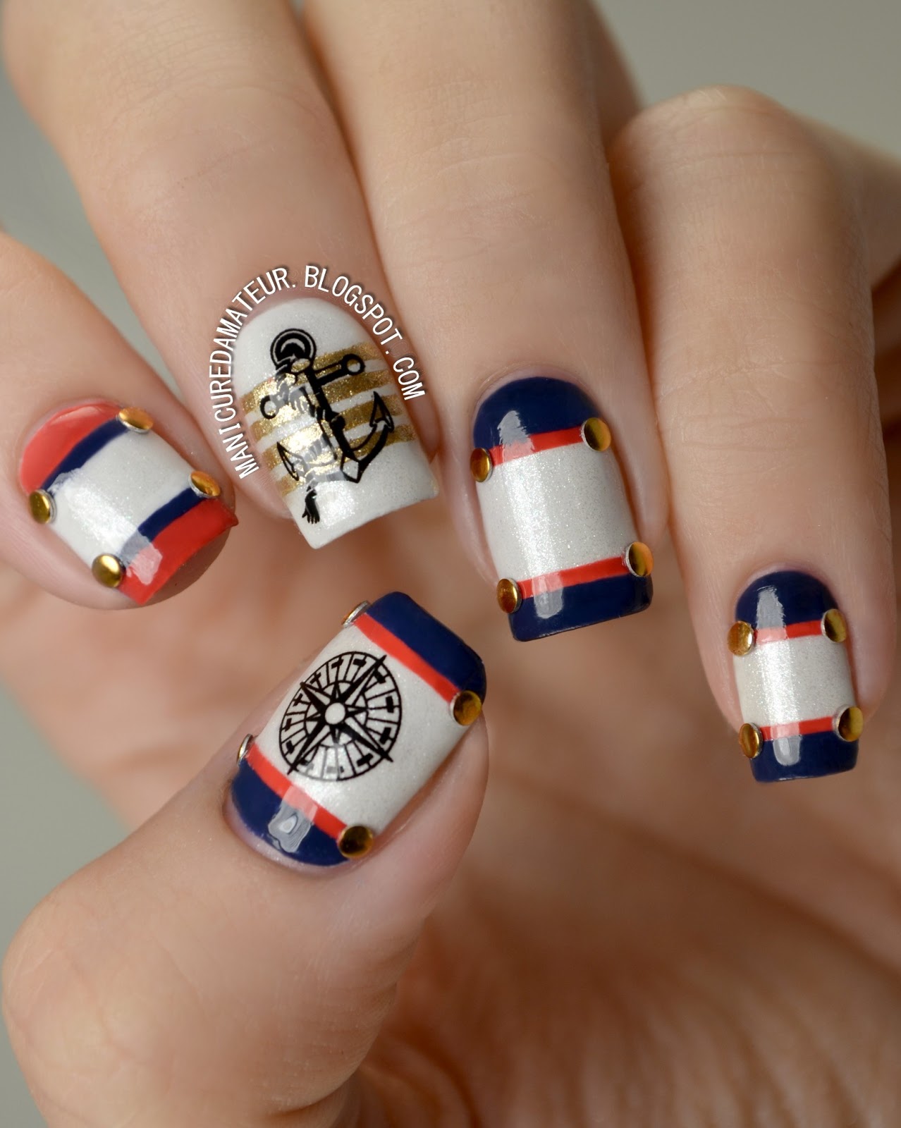
Nautical Nail Art featuring Born Pretty Store Anchor & Compass Water Decals


Happy July everyone!

I can't believe over half the year is already gone.
Whether I believe it or not, we're deep into the heat and I wanted to create a nail art look that was both summery and patriotic.

Red white and blue is a combination I save exclusively for this time of year and now that's here I'm ready to kick things off with a nautical look using Born Pretty Store Achor and Compass Water Decals.

This is actually my first attempt using stickers or decals.
Up until now I avoided using such decorations for the same reason I initially dismissed polish appliques.
In short, I thought they were "cheating."

I'll already tell you that after this look, I changed my mind.


First I needed a small arsenal of colors before working with the decals.


From left to right:

Julep "Nan"
Avon "Golden Vision"

Sinful Colors "Snow Me White"
Wet n Wild Megalast "Break the Ice"
Sinful Colors "New Wave"

Each finger started with a two coats of SC Snow Me White. 
To add a little summer glow if you will, I then added one coat of Wet n Wild Break the Ice for a subtle shimmer.

To create the stripes on all but my middle finger, I took four pieces of nail tape and taped off two baby stripes.

On my thumb, pinky and ring finger I filled in the stripes with Julep Nan and pulled off the tape while the polish was still wet.
I then took a small, flat nail art brush and filled in the bottom and top edge of the nail with Sinful Colors New Wave.
I used the same technique on my index finger, but reversed the colors.

I then turned to my Born Pretty Stud Wheel and added small round gold studs where each little stripe met the edge of my nail.

To create the stripes on my middle finger I placed five evenly spaced pieces of nail tape and painted over the gaps with Avon Golden Vision, removing the tape in the same manner as before.


Now on to the decals!

This specific set of decals comes with one sheet of 20 decals in a variety of two different anchors and three different compasses.

You can purchase these decals through Born Pretty Store's website here and are priced at $2.86.
But don't forget you get 10% off your whole purchase with my discount code BHL91!


Even though directions are included on the back, they contain unnecessary steps are actually more complicated than the actually process.

Here's how I applied the decals.

1. Cut out desired image.
2. Remove clear plastic film.
3. Drop in water for 10-20 seconds.
4. Remove image from water with tweezers.
5. Place image face down on finger (not the nail!) and gently slide the decal off the backing.
6. Pick decal off finger with tweezers and place on the nail.
7. Let dry.
8. Apply top coat.

Notice I didn't use a paper towel or blow dryer or any other means of drying the decal prior to placement.
Skipping this step gives you a few seconds to shift the image around the nail if needed.

The process is so quick and I am incredibly pleased with how flush the image is with the base.
You don't see any clear outlines and the image really sits and looks like it's just apart of the polish underneath.

The images themselves are not pixelated, nicely detailed, and remove just like any polish.


There you have it!

The most time-consuming part of the design was obviously the taping, but it's a simple look that's suitable for all skill levels.

I'm in full support of these decals for those who aren't ambidextrous but desire detailed designs on both hands.

There are so many decals out there, and now I'm itching to try them all!


 What do you think of this summer sails design?
Have you tried any nail art decals?

Let me know in the comments below and give this look some love on Facebook, Instagram, Tumblr and Pinterest.
Remember that Google Reader retires TODAY, so keep up with The Manicured Amateur on Bloglovin' and Feedly for all updates!


Also, if you'd like a more visual tutorial on applying water decals, give me a shout on Facebook or Twitter! 

Thanks for reading!

-Melody


**Born Pretty Store products provided for my unbaised review. This post contains affiliate links.

Saturday, June 22, 2013

Simple Summer Skittle Manicure featuring KKCenterHK 3D Bow Accents


Hi everyone!

So as most of you know, I've had quite the busy past few weeks. 
Things have been hectic as I've been suffering through dog fights, broken cars, landlord trouble, a tree falling on the house and now...moving out.

Complicated times call for simple manicures.
I need a look that's quick and can survive a day of packing, but can be dressed up for an evening with friends.

Sort of like a simple white tee...but for nails.


This is where a skittle mani with 3D decorations come in.
It's a simple solution that looks like you put in much more effort than you actually did.

All you need is a few colors, some cute accents, and you're good to go!


From left to right:


Wet 'N Wild Wild Shine "Hallucination"
Orly "Gumdrop"
Avon Mega Watt "Pop"
Sinful Colors "Snow Me White"
Avon "Inspire"

(Not Pictured) Out The Door top coat


For this particular skittle I wanted to choose colors that would later match the 3D bows.


Each finger began with a base layer of Sinful Colors "Snow Me White".

The pinky finger received two coats of Avon "Inspire".


The ring finger and thumb (not pictured) were left white but I chose to add a single coat of WNW Wild Shine "Hallucination," a subtle glitter top coat with an iridescent shimmer that matches the color palette perfectly.


The middle finger received two coats Avon Mega Watt "Pop," but a bit of shrinking still revealed the white base along the tip of the nail.

The index finger was layered with one coat of Orly "Gumdrop." 
The white base isn't really necessary for this particular shade, but it just saved me some time.


With a generous coat of Out The Door, I left the colors alone while I packed up a few things and moved some furniture.

When a couple of friends asked my boyfriend and I to join them for dinner, I decided I wanted to give the skittle an extra something.

I had little time on my hands, and automatically turned to my multicolored pearl wheel from Born Pretty Store.
Choosing a corresponding pearl for each finger, I dotted a bit of top coat onto the nails and placed the pearls accordingly with a small dotting tool.


What really brought the whole look together was these adorable bows from KKCenterHk.

The bows come in a pack of two and retail for $4.
Each bow is measured at about 10mm x 6mm x 2mm and can be applied with top coat, or nail glue if you want a longer hold. They are also resuable, so you are reassured that you are getting your money's worth.


At first I thought the price was a bit steep, but then when I noticed the patterns and details with each option I   felt the price was well justified.

There are 48 color and patterns available for this shape and style alone, which can been seen here.
It was hard to choose just one, but I ending up going for this cute Cyan Floral Print bow.


Even though my nails beds are tiny, I was pleasantly surprised by the overall look on the nail. It doesn't appear incredibly large, although it does stick out.

Knowing I wouldn't be wearing them for too long, I chose to apply the bows in the same manner as the pearls, and even then they stayed put up until I chose to take them off.

If you are not used to have a large decoration on your nail, it may feel funny at first. 

I was very aware of the presence of these little guys, and was may be a bit too careful about bumping or snagging them at first.
I got used to them pretty quickly and only noticed them when I ran my fingers through my hair.
I often snagged a few strands up under the bows, but they didn't budge.


It's not the most original or astounding look I've ever created, but it's a fantastic demonstration of how small details can make a big difference.
Small decorations like these 3D bows can turn an ordinary manicure to an extraordinary one.
I received multiple compliments and couldn't help giggle at how little time and effort I really put in it.

Dare I say that it's amazing nail art for the lazy nail artist?


What do you think of this cute bow featured skittle look?
What's you favorite quick nail art fix?


Let me know in the comments below and give this look some love on Facebook, Instagram, Tumblr and Pinterest.

And don't forget! Google Reader is saying goodbye is just over a week, so make sure following me on Twitter and Bloglovin' for all updates.

Thanks for reading!

-Melody


**KKCenterHk products sent for my honest review. This post contains affiliate links. For more details, please see my disclosure policy.

Saturday, June 8, 2013

Sinful Colors Sail La Vie/Ahoy There Collection Review + Nautical Nail Art!


Hi everyone!

I gave everyone quite the build up to this collection with a preview of this nautical nail art design.


Only one collection was used to create the whole look.
Yup, it's the new Sinful Colors Sail La Vie/Ahoy There Collection!

The Collection

Sinful Colors has thrown us overboard once again, giving two different names to the same set.
If you visit Walgreens you'll see this as the "Sail La Vie" collection.
If you visit Rite-Aid, you'll see an entirely different display with the title "Ahoy There!"
I have no explanation as to why the company does this, but the collection is the same both in shades and in price.

Each shade is sold individually for just under $2.


The collection consists of three older core shades and five brand new shades.

Snow Me White
Out of This World
Cross My Heart
Anchors Away (NEW)
Sail La Vie (NEW)
My Bouyfriend (NEW)
New Wave (NEW)
Into The Blue (NEW)


The Colors

Snow Me White is well...white.


Can't really get any more basic than white. If applied thickly it's opaque in one coat, but I prefer two thinner coats as shown in the photos.

This is a cost effective, dependable white. I've actually purchased this on multiple occasions.
It's a good stamping white and I turn to it often.


Out of this World is a light silver foil.


For being one of the brand's older shades, I expected this to go full frost on me. Minus a streak or two revealed in the second photo, it's completely smooth.

The only downside it that it's pretty sheer and takes three coats to reach full coverage.

I like that it's on the lighter side of silver, as most silver foils have a shinier, gunmetal undertone.
If you're looking for a budget-friendly foil, give this one a shot.


Cross My Heart is a hot, cherry to chili pepper red jelly, depending on the light.


Being a jelly, it takes four coats for full coverage on it's own, although you lovelies sporting short nails can get away with three.

The formula is perfect. It's not thick or goopy and applies completely even.
I love reds, but don't often wear them due to their staining power. This one didn't stain a bit.


Why do I really love this color?
It turned out to be a neon in disguise!

It takes on a more orangey tone, but it's freakin' bright.
The picture just can't do it justice (because photographing neons are pain in the tukus). 


Anchors Away...well, it's a golderod, dandelion yellow-orange creme with the most subtle microshimmer.
Yeah.


This color boggled my mind. 
In most lighting situations the bottle looked more yellow, but on the nail it looks more orange. After surveying my boyfriend, roommate, and taking over 500 photos of this color alone I've decided to let YOU decide.


Is it orange or yellow? Let me know in the comments below!

Whatever color it is, I absolutely love it. It's just so interesting. 

The formula was on the thin side and needed two coats. 
The microshimmer is pretty non-exisitent, and can only be seen on the brush during application, and looking really really under direct sunlight.


Sail La Vie is light, periwinkle blue creme with barely-there microshimmer.


The formula on this one is identical to Anchors Away. 
Two coats got the job done, and the microshimmer isn't even worth mentioning.

This one was a bit hard to photograph, and I can only hope the purple undertones translated well enough into the photos.

It's so gorgeous and versatile. 
It's light enough for spring, bright enough for summer, and icy enough for  winter.


My Bouyfriend is rich, medium periwinkle blue creme.


This is literally a darker version of Sail La Vie. 
The purple tones were better captured in this one than it's  lighter counterpart.

The formula is thicker, making it a one coater.

I don't have much to say. It's gorgeous and one of my favorites out of the lot.


New Wave is a muted navy blue creme.


The formula to this one is identical to "My Bouyfriend". Great consistency and opaque on one coat.

The color is pretty, but doesn't wow me. It's the darker sibling to an older shade by SC called "Rain Storm" which you have seen me use as a glitter base on multiple occasions.


Into The Blue is a deep-but-bold blue crelly.


Although this has the thin, crelly-like formula, it's a one coater.

I don't know how and I don't care. It's amazing. It's much bolder in person but the camera can only take so much.


 I thought I'd knock out two birds with one stone and show you all the blues in daylight, side by side.


...and then put altogether, I came up with this:


There are so many ways to go with a nautical palette such as this one, and I really wanted to utilize every shade I could.


With all of the blue tones in the collection, an ocean scene was the first thing that came to mind.

It all started with a simple gradient using Sail La Vie, Anchors Away, Cross My Heart, and Sail La Vie again at the bottom.

I continued to dab on different layers to create a one-point perspective sunset in the background.

The sail boat was sort of messily free-handed. I intentionally made the sails wobbly to imitate the idea of wrinkles. But of course, looking at it up close just makes it come across messy.

Basically the entire thing was painted by hand, adding depth and detail until I was satisfied or got tired. I forgot which came first. It was a lot easier than it looks (just time consuming). 
If you can paint the sail boat, what you do with the background is up to you.

The french tips were also free-handed and is something anyone can do.

Beginning with Snow Me White as my base, I took a short striper brush and created the "smile line" using Anchors away. I then painted the area beneath with Into The Blue and then created a large stripe through the middle with Snow Me White.

In retrospect I could have just painted the edges with Into The Blue and saved time and polish, but you live and learn right?


Overall

I love a collection that can get me inspired right off the bat, and this set did just that (run away, she's rhyming again).
I am pleased with the finish look of my design and the colors used to make it happen.

For an eight shade collection under $20, you can do some great things. There are some basic staple colors, along with more unique hues that can be happily worn on their own.

My standouts are Anchors Away, Sail La Vie, and My Bouyfriend.

Which colors are you favorites?
Will you be picking any of these up?
What do think of my nautical nail art look?


Let me know in the comments below and make sure to give the look some love on Facebook, Instagram, Tumblr and Pinterest!


___


I know I left everyone hanging for a couple of days.
The stress from the event of this week called for some major R&R.
So I pushed life aside for a time to catch up on sleep, come with a housing plan, and seek advice from family and friends.

Even though the repairs have finally begun on the house after the tree incident (story here), it's just been too much.
My boyfriend, roommate and I have had enough.
My roommate made the decision to move out, forcing us to do the same.
Financially my boyfriend and I aren't prepared to look into a place of our own, but a friend has opened up her home to us while we save up and wait for something to become available.

Even though it's scary and unexpected, that's life.

What does this mean for the near future of The Manicured Amateur?
NOTHING BUT GOOD. And I've finally realized it.


No longer dealing with my landlord's ill practices means we can finally catch up on finances and get money put away.
As much as I hate to say it: more money means more opportunities.
..and it also means more polish!
Even better? Our new roommate is a fellow polish lover!
I have some great post ideas involving twinsies posts, nail art for shorties and more.

So keep up with me on Facebook, Twitter, and Bloglovin',
because things are about to get much more interesting around here!

If I miss a day or so, forgive me. 
I'll most likely be buried in cardboard boxes, that is, if the cats haven't beaten me to it.

Thank you every one for your support and thanks for reading!

-Melody

Monday, May 20, 2013

Summer Striping and Studded Ruffian Nail Art


Hi everyone!


Today I have a bright nail look for you!

Looking back through the designs I've posted I realized it's been too long since I've done a tape mani.
So today's design features a bright combo of stripes and studs.


The Steps

My thumb a pinky fingers began with a base of Essie Butler Please. 

I then took my striping tape and placed a small strip horizontally across the nails at an angle. I then cut smaller strips and placed them vertically in an angled but evenly spaced striped pattern, beginning from where I placed the horizontal piece.

I then took Sinful Colors Unicorn (swatched here) and eyeslipsface Mango Madness (swatched here) and painted within the stripes with a small, flat nail art brush.

While the polish was still wet  I removed the strips and finished with a line of studs from my Born Pretty Store stud wheel which you can purchase here (use code BHL91 for 10% off).

My index and middle finger began with a base of eyeslipsface Mango Madness. 

I went over the top third of my nail with Essie Butler Please to create a sort of exaggerated ruffian look that came to a rounded point. 
(Ruffian manicures are simply inverted half moons.)
I outlined the ruffian edge with Sinful Colors Unicorn with a long striper brush and finished with a single stud from the Born Pretty Store stud wheel.

My ring finger was created using the same method as my index and middle fingers, except I began with Sinful Colors Unicorn as my base and used eyeslipsface Mango Madness as the outline.

All nails were given one good coat of  Sally Hansen Ultimate Shield Base and Top Coat.


I really loved this color combination. It's bright and fun and a perfect match for the a day in the sun.


What do you think of  this bright design?

Let me know in the comments below and make sure to give this look some love on  Facebook, Instagram, Tumblr, and Pinterest!


And keep up with me on Twitter, and Bloglovin' for more nail art looks and some exciting new collections I'll have to share with you soon!

Thanks for reading!

Melody

Thursday, May 16, 2013

Polish4Pennies: Drugstore Clearance Finds - CQ & Sinful Colors


Hi everyone!


I first want to say "hello" to the wave of new visitors who found me through the I Love NP and Zoya Facebook pages. 
With the nail art community growing so rapidly, I'm so humbled that there's enough of you polished lovelies out there that are interested in what I'm up to. So thank you!


Today I want to do something different. I've been stretching out my pea brain muscles working on ideas for a variety of themed posts. 


The first thing I thought of was my polish purchasing habits. As much as I'm willing to splurge for the coolest collections and Indie favorites, most of the time my wallet is bone dry since I lost my job due to my chronic illness over a year ago.


So how do I satisfy my polish habit without my boyfriend having a heart attack? Pay in change! I'm a thrifter at heart, and am not ashamed to say I'll rush to a sale/clearance section before looking at anything else. Nail polish is no different, especially when it comes to the drugstore. 


Recently my local Rite-Aid had a little bin of $.99 polishes, and I scooped up the only four colors I didn't already own. I have individual swatches to share with you, along with a spur-of-the-moment nail art look combining the colors.

So let's take a look!


The Polishes


First up is  CQ "Honey," a white-based, buttery yellow creme.


CQ is an overlooked brand, mainly because of the availability. They do not have a website, and I've only seen them in Rite-Aid stores. Others have spotted certain shades at Walmart, but none of the ones in my area seem to carry them. If you don't have a Rite-Aid in your area, I'd turn to Amazon or eBay.

It's a shame because the formula is fantastic! Honey had the slight streaky problem of most yellow polishes, but this is actually one of the creamiest yellows I own by far. It was extremely easy to work with. I used two coats for the photos to smooth the streaks. 

The warm undertones also make this a more flattering yellow than the highlighter hues you've been seeing me sport recently. I'm a fan!


Next is another CQ in the color "Corduroy," a muted teal creme.


The formula was thinner than honey but still just  as easy to work with! It's possible to get away with one coat, but I went with two to ensure the color was really saturated. 

Best part? This is one of the few teals I have that does NOT stain. 
That gives it a two thumbs up in my book!


My next find brings me back to good ole' Sinful Colors in "San Francisco," a a shimmery emerald green.


The shade surprised me. Not only was it extremely sheer, but it was really runny. Not one other SC polish I own has this behavior, so I was a bit disappointed when it took me three to four coats to get it to full opacity.

It's not devastating enough to take away from its shiny goodness. I was relieved when it didn't turn out to be a frost, which is why I think I hadn't purchased it before. It is lighter than I expected, but it's still a nice, festive green for holidays  and can be paired with some chunky glitter for some real razzle dazzle!

The second photo is in the shade, where you can better see  how it would appear sheer if applied with anything less than three coats. It even looks thin on the nail.


My fourth find is Sinful Colors "See You Soon," a black-based, dark dark shimmery teal blue.


Now before I go any further, I don't own Essie Dive Bar...but by the swatches I've seen this looks to be a dead-on dupe for it, but for a quarter of the cost.

I can't compare the formulas of the two, but compared to San Francisco I just showed you, See You Soon is an improvement. The formula was still a bit runny, but it was no where near as sheer. The first coat is what led me to believe that it's actually a black-based polish, but my eyes could have deceived me. I went ahead and added another coat to intensify the shimmer.

I have no idea why I hadn't purchased this one before. I suppose I assumed it was a frost, but it is definitely not. It's a beautiful color. I do have others similar from Wet 'N Wild, eyeslipsface, and Nicole by OPI, so needless to say it's not an original color. I will say that if you saw Essie's  Dive Bar and have yet to purchase it, reach for this one instead.

Once again, the first photo is in the sun and the second is in the shade. Even without direct sunlight this color still sparkles. 
Gotta give it props for that!


 Nail Art Inspiration

Often times I'll pick up a polish on clearance without even having an idea on how or when to use it. In this case, all four of these colors complimented each other in a way that I just had to find a nail art look that utilized them all.

I did end up skipping San Francisco, but the other three were used to create the look you see below.
I don't really know what to call it, but it's not half bad.


I started with See You Soon as the base. 

Then taking a small nail art brush I made random strokes with Honey starting from the lower left of the tips and bringing the brush upward diagonally. 

After cleaning my brush, I left a bit of polish remover on the brush and dipped it into a dot of Corduroy and repeated the same step as before. Leaving the remover on the brush waters down the polish, creating a smudgy, blended effect. 

I finished with a few dots of Honey on the opposite side of each nail.


I kinda went to far with the blending and the longer I stare at the close-up shots, the messier I think it looks. 
I usually wouldn't post a design I wasn't entirely proud of, but in person it looked cool.

Could I have done something entirely different with these polishes? Oh sure, the possibilities were endless. 

Unfortunately, if you follow me on Facebook, Twitter or Instagram then you know I'm trying to treat my wounded dog who is suffering from an infected and possibly sprained leg from injuries sustained from a fight with my roommates dog. 

So all my nail painting took place with poor Odie in my lap, meaning I used his  little cone head as a hand-rest. It was the only time his little nub tail would wag. He's attention-starved no matter how he feels.

Oh life. Le sigh.


What do you think of this design?
What are you polish purchasing habits?

Let me know in the comments below and share you thrifty finds with me on Facebook!


And keep my little Odie dingo in your thoughts for a full recovery. All it took was him coming up behind Buster while he was excited and digging in a hole. It scared Buster and the fight broke out immediately. 
My sappy little dachshund/lab/chow mix is no match for an aggressive American Bulldog/Pitbull mix that's twice his size. :(

Posting should be kept to a normal schedule, so make sure to keep up with me on Twitter and Bloglovin'!

Thanks for reading!

-Melody
Related Posts Plugin for WordPress, Blogger...